Welcome to Weber! In this learning path, I’ll show you to all the things that make Weber website builder a unique, visual-first website experience platform. Whether you’re a designer, developer, marketer, or just a curious beginner you’ll walk away with the foundations you need to start your journey.
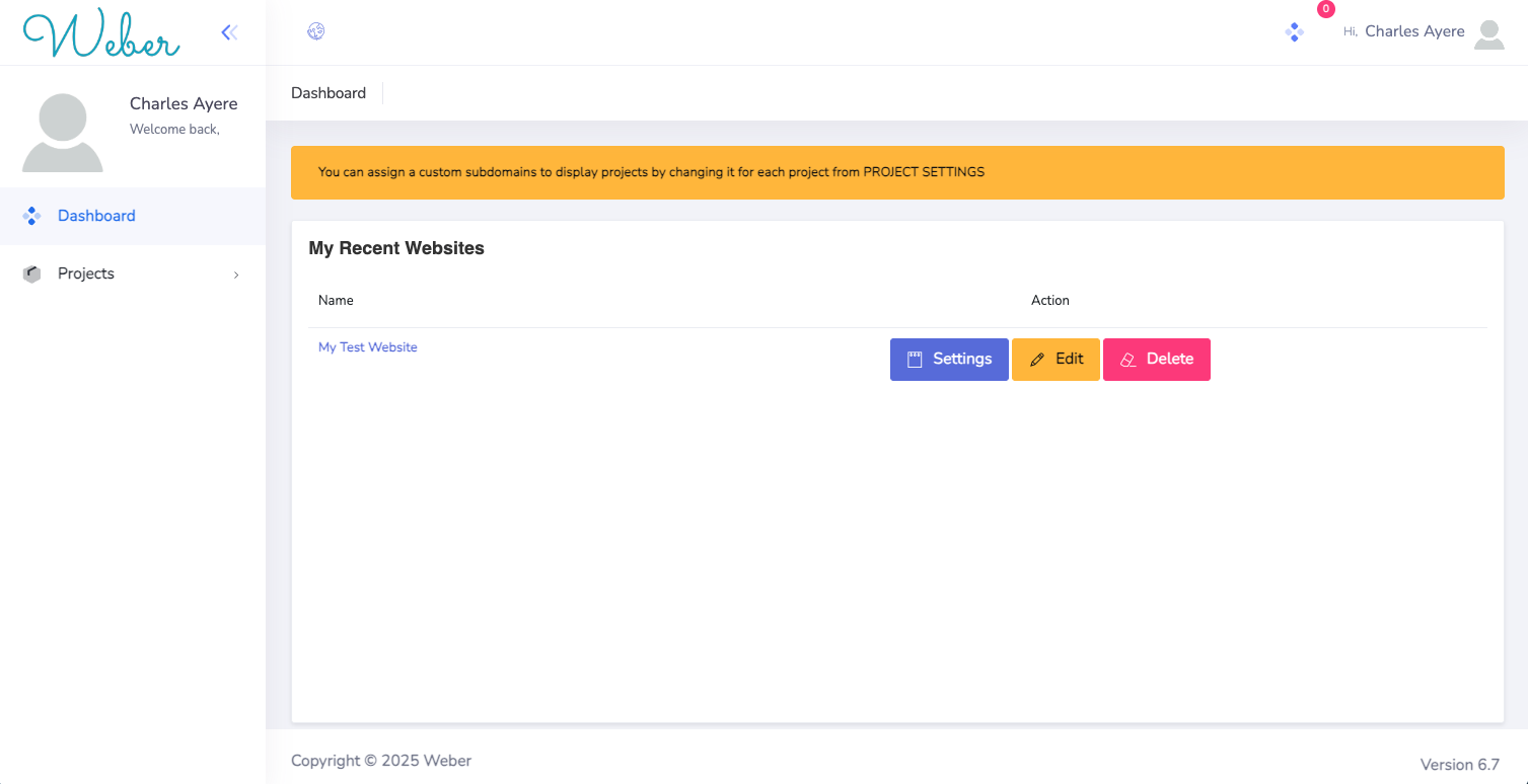
This is the User dashboard, the first place you'll see after signing in. On the right side, you have a tab called "Projects" this is where your projects will reside. There are 3 actions which can be be done to projects they are highlited in 3 different colors the blue for settings for that particular project, yellow for edit and the pink for delete (Use with caution).
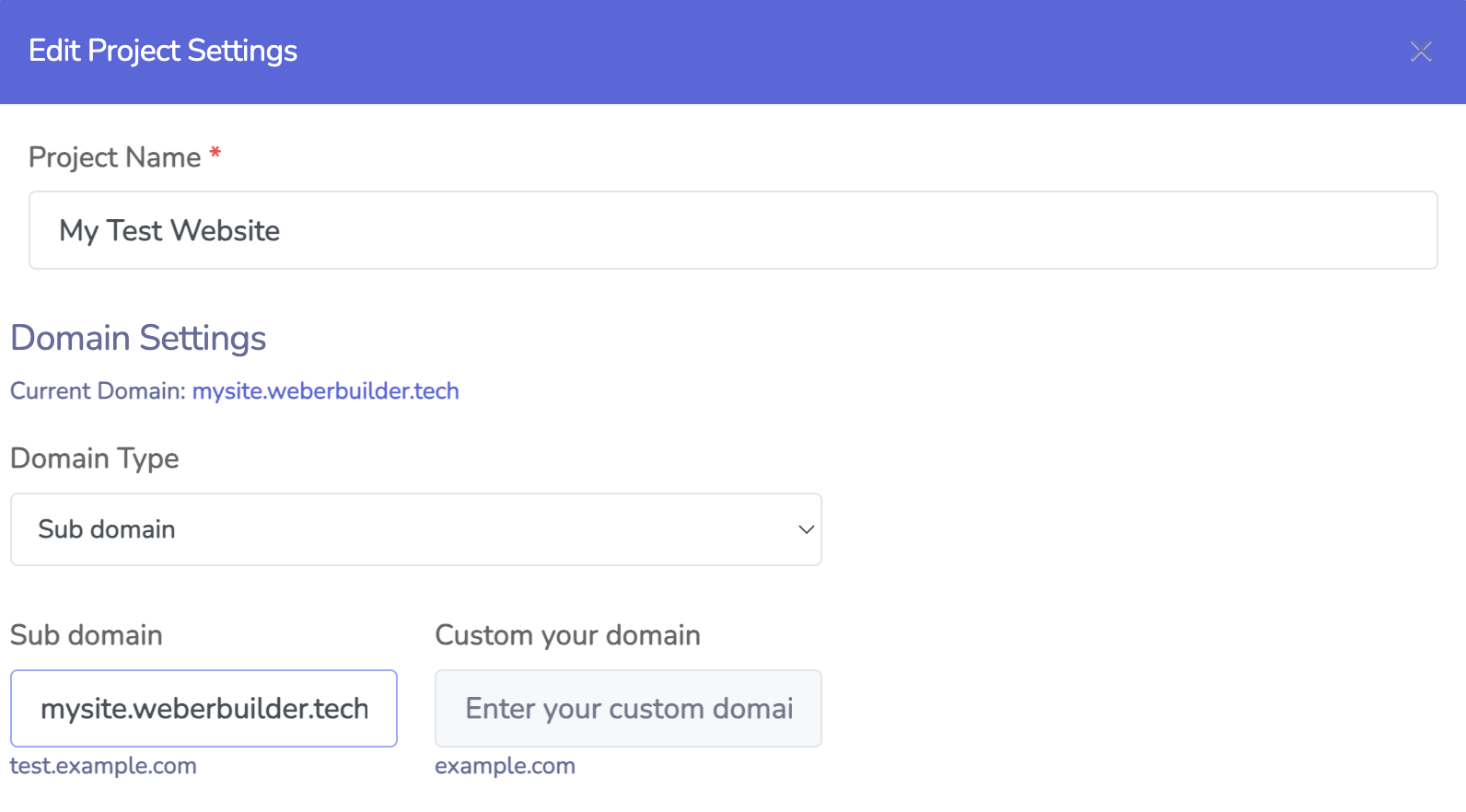
In the project setting page, you can make changes to the project name, change domain type, or choose a custom domain (More on this later).
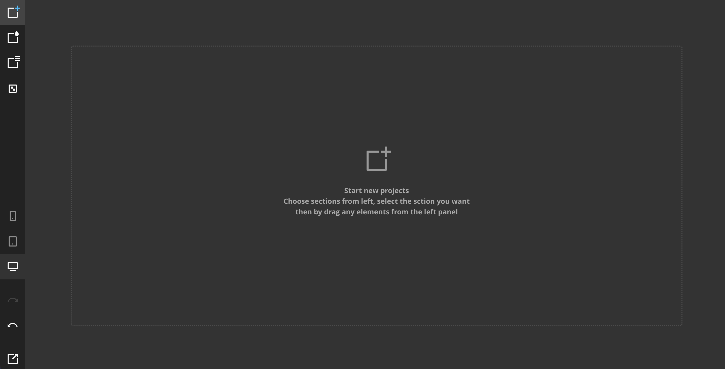
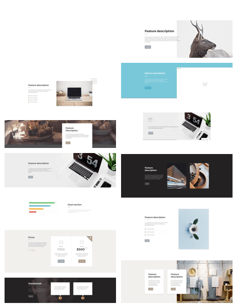
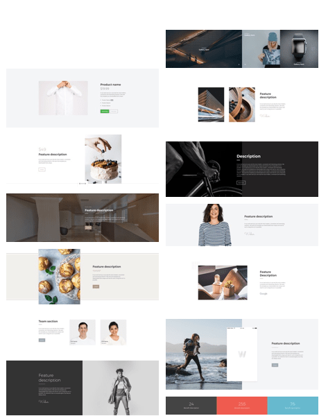
Then there's the center of attraction which is the Weber Canvas. This is where the magic happens. Everything you need to create your next piece of art exists at the right side of this screen. We will go into details in a bit

With this tool, we can add sections, delete, copy and configure them. To enable this mode - select the top icon in the left panel. To display the section options, just point to it in the work area and choose your from a list of sections to add.

In this mode, we edit the elements globally (changing the parameters for all the like elements) and locally (changing one specific element). For global editing, just select this mode (the second icon is on top of the panel) and select the element you want to edit from the list.

In this mode, we can add new pages, or just rearrange pages as we see fit
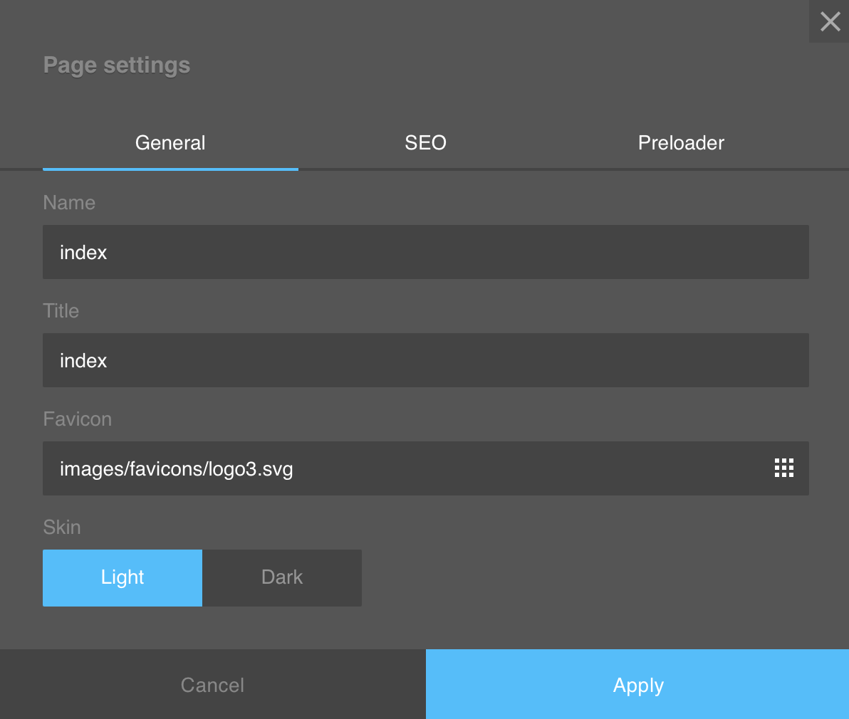
Clicking on the setting icon for a particuar page gives the following options changing the name of the page, it's title and the favicon for that page. we can also choose to change the default state of that page from light mode to dark mode.
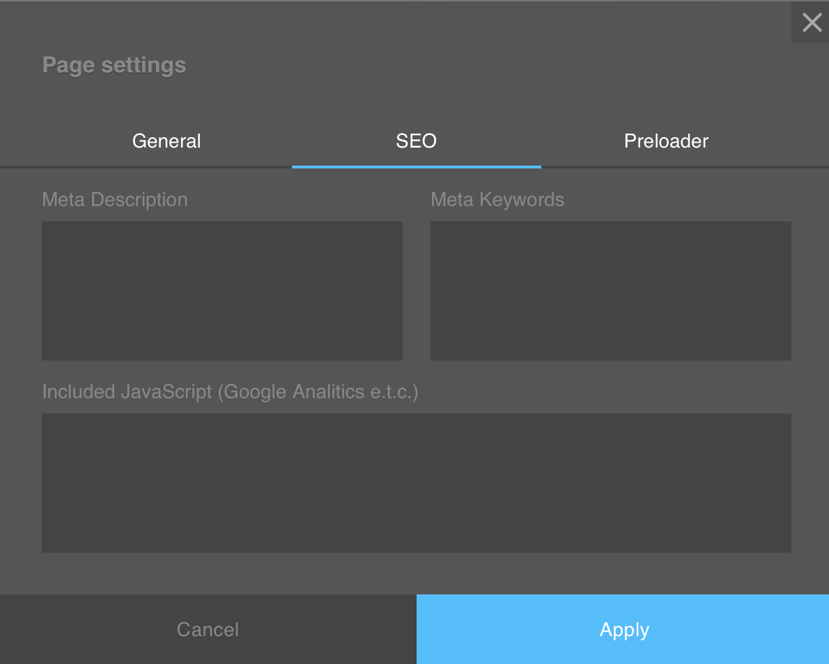
The SEO Page shows the options availabe for search engince optimization.
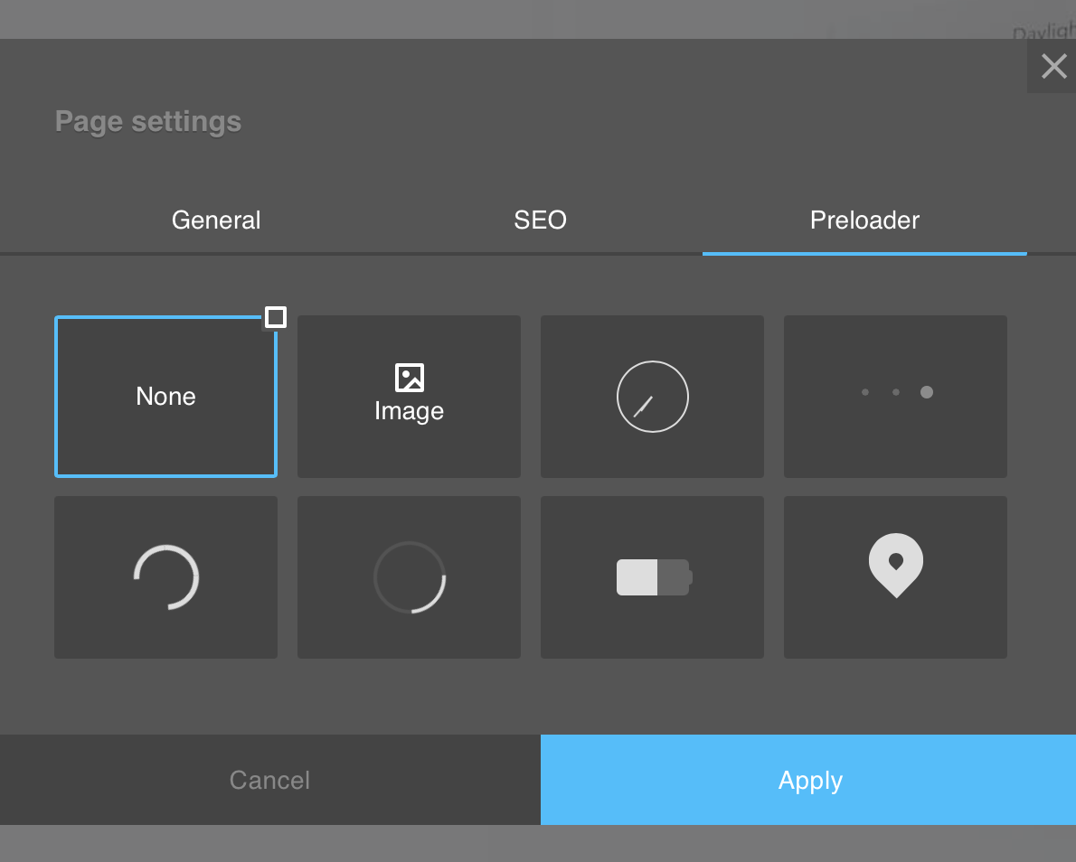
The preloader page shows the list of animations that should show when the page is being loaded.

This tool allows you to check the mobile responsiveness of your website and make changes on different viewports. we have the mobile, tablet and Desktop viewports.
Note: Changes made on other viewports are saved for that specific viewport.
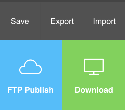
The Save button allows you to save the website as a project file, the export allows you to export your website as code while the import allows you to import existing project files.